Catch Up To Live
Platforms: TV
Operating systems: tvOS/Android
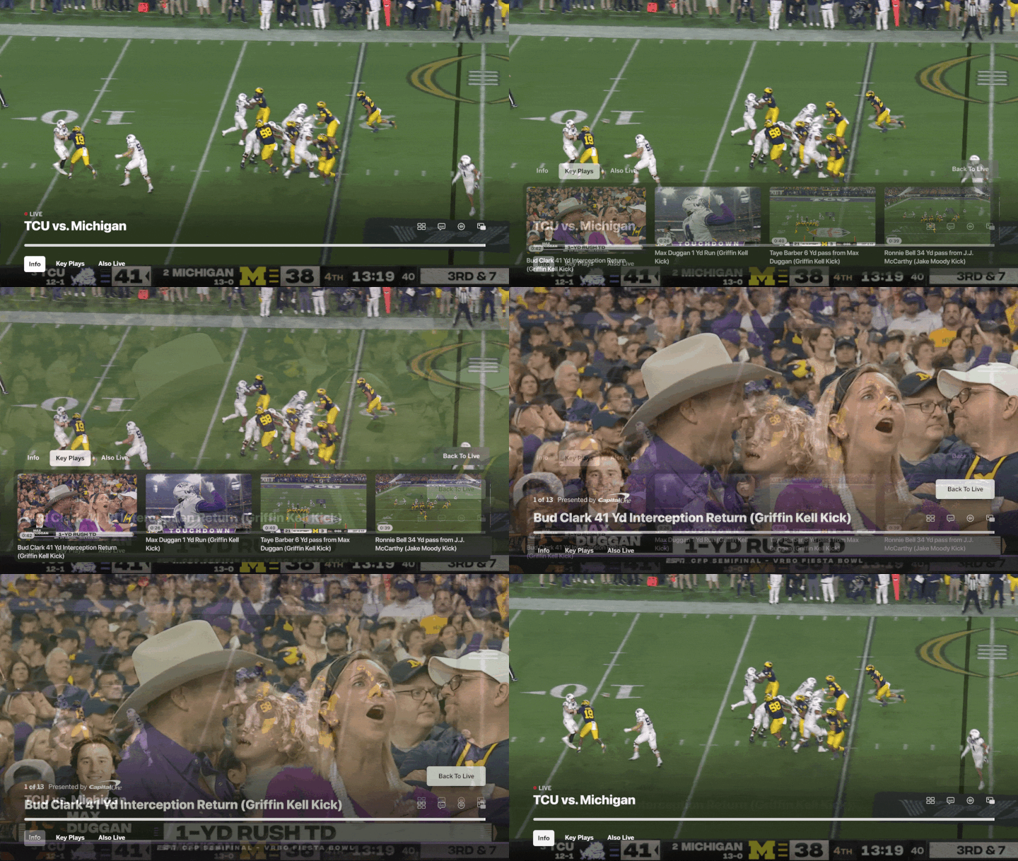
The primary objective of the Catch Up To Live initiative was to empower TV users to catch up to a live game via highlights. In my capacity, I worked in collaboration with Product, Development, and Editorial teams in order to ensure unifying visions and goals. My responsibilities also encompassed the creation of high fidelity mockups and prototypes for iOS and Android, coupled with the provision of comprehensive specifications to guide the engineering teams during implementation.
Overview
The Challenge
There was a growing need to enhance the mobile user experience and provide users with more control over the information they received. Recognizing this, the goal to develop a system that would enable users to customize their push notifications based on specific events of interest. By doing so, it aimed to empower mobile users the ability to stay informed and engaged with the content that mattered most to them.
The Goal
The primary objective of the Catch Up To Live project was to empower mobile users to selectively receive push notifications tailored to specific events.
The Solution
Allow users to easily navigate and personalize their notification preferences through an update interface. This application provides a range of options to select specific events or topics of interest, ensuring that users received relevant and tailored push notifications.
Competitive Analysis - YouTubeTV & Peacock
UX and UI Comparison: YouTube TV & ESPN Live
YouTube TV
User Experience (UX):
Comprehensive and Versatile: Offers a wide range of channels and content types, making it suitable for diverse viewing preferences.
Personalization: Supports multiple user profiles, each with personalized recommendations and DVR settings.
Ease of Use: Intuitive interface with easy navigation between live TV, DVR, and on-demand content.
User Interface (UI):
Clean and Organized: Simple layout with clear categories for live TV, library, and on-demand content.
Responsive Design: Consistent experience across devices, including smartphones, tablets, smart TVs, and web browsers.
Visual Appeal: Modern, minimalistic design with high-quality thumbnails and previews.
ESPN Live
User Experience (UX):
Sports-Centric Focus: Tailored specifically for sports fans with comprehensive coverage of live sports, scores, and updates.
Interactive Features: Offers customizable alerts, real-time updates, and personalized sports news.
Engagement: Includes expert analysis, commentary, and interactive features like polls and live chats during events.
User Interface (UI):
Dynamic and Informative: Rich in visual content such as game highlights, scores, and live updates.
Sport-Specific Navigation: Easy access to different sports categories and events.
Themed Design: Incorporates ESPN's brand identity with bold graphics and a sporty aesthetic.
Key Differences
Content Focus: YouTube TV's UI/UX is designed for a general audience with diverse content, while ESPN Live is specialized for sports enthusiasts.
Navigation: YouTube TV offers a more generic and straightforward navigation, whereas ESPN Live provides sport-specific pathways and interactive elements.
Personalization: Both platforms offer personalized experiences, but YouTube TV focuses on viewing preferences across genres, while ESPN Live tailors to sports interests and updates.
Design Aesthetics: YouTube TV features a clean, minimalistic design, while ESPN Live emphasizes a dynamic and bold sports-centric look.
User Flows
This diagram of information architecture helped distinguish the organization of data flows and controls, logical design, and physical implementation.
The hierarchy planning of the site serves as way of dictating the end user’s success. By determining the user behaviors and achieving the ultimate goal of user retention and user conversion, the team was able to decide the common behaviors of these users.
The process of finding a product, selecting a product, entering it in the cart, and proceeding to shipping/payment is conceptualized through this graph.
User Flows
No ESPN+ auth
ESPN+ stream
Click on tile → ESPN+ paywall → if auth, toastNo TVE auth
TVE stream
Click on tile → MVPD picker → if auth, toast
Wireframes
For the Catch Up To Live project, developing design systems for both iOS and Android platforms was essential for creating a cohesive and user-friendly experience across different devices. Design systems provide a set of standardized guidelines, patterns, and components that ensure consistency in visual aesthetics, interaction patterns, and user flows. By following platform-specific design principles and guidelines, designers can tailor the user interface and experience to the unique characteristics of iOS and Android devices, optimizing usability and familiarity for users. This approach streamlines development efforts, promotes efficient code sharing, and facilitates seamless integration with platform-specific features, resulting in a polished and native feel for Watch Alerts on both iOS and Android platforms.
Prism Design System Implementation - iOS & Android
Android (Light Mode & Dark Mode)
Prism is the name of Disney's design system. The name "Prism" comes from a single source of light that passes through a prism, it is dispersed at a variety of angles to produce a rainbow of colors. This metaphor matches their strategy - by taking one universal framework, intersecting its elements in different ways, and passing them through distinct brand style guides, they are able to produce a kaleidoscope of products and experiences.
For the Watch Alerts project, developing design systems for both iOS and Android platforms was essential for creating a cohesive and user-friendly experience across different devices. Design systems provide a set of standardized guidelines, patterns, and components that ensure consistency in visual aesthetics, interaction patterns, and user flows. By following platform-specific design principles and guidelines, designers can tailor the user interface and experience to the unique characteristics of iOS and Android devices, optimizing usability and familiarity for users. This approach streamlines development efforts, promotes efficient code sharing, and facilitates seamless integration with platform-specific features, resulting in a polished and native feel for Watch Alerts on both iOS and Android platforms.
Themes
Components
Icon Usage Guidelines
Prism Design System Implementation
Android (Light Mode & Dark Mode)
Prism is the name of Disney's design system. The name "Prism" comes from a single source of light that passes through a prism, it is dispersed at a variety of angles to produce a rainbow of colors. This metaphor matches their strategy - by taking one universal framework, intersecting its elements in different ways, and passing them through distinct brand style guides, they are able to produce a kaleidoscope of products and experiences.
For the Watch Alerts project, developing design systems for both iOS and Android platforms was essential for creating a cohesive and user-friendly experience across different devices. Design systems provide a set of standardized guidelines, patterns, and components that ensure consistency in visual aesthetics, interaction patterns, and user flows. By following platform-specific design principles and guidelines, designers can tailor the user interface and experience to the unique characteristics of iOS and Android devices, optimizing usability and familiarity for users. This approach streamlines development efforts, promotes efficient code sharing, and facilitates seamless integration with platform-specific features, resulting in a polished and native feel for Watch Alerts on both iOS and Android platforms.
Entry Point Options (End Results)
High Fidelity Mockups
These high fidelity mocks allowed stakeholders to visualize the design and user interface in detail, facilitating better feedback and collaboration. High fidelity mockups also aided in identifying potential design flaws and usability issues before the development phase. Additionally, they serve as a reference point for developers, ensuring the accurate implementation of the intended design elements and interactions.


