Realogy (ERA)
Industry: Real Estate
Platforms: Web/Mobile
Team:
Product Designer
3 Developers
Product Manager
Project Manager
Role: Product Designer
The Realogy Franchise Group delivers value to sales agents and brokers by providing powerful marketing, mentorship and training, general sales support systems, services and tools.
My role was to transition their B2B system to a direct-to-consumer model. In addition, I was responsible for developing a strategy for maintaining and increasing user conversion/user retention. Finally, I designed a user interface that was engaging, informative, and aesthetically pleasing.
Overview
The Challenge
ERA needed an updated user flow, updated look/feel, and an updated way for users to reach agents. Given their current model, there is no way to reach an agent immediately.
The Goal
We started by interviewing our stakeholders to get a better understanding of the business, users, competitors along with where they are and where they want to be. Next, we used Lean Survey Canvas and sent the survey to the actual customers through ERA’s communication channels.
The Solution
We made the questionnaire shorter and added the opportunity to skip the steps to enable the users to complete their profiles later. We also included the property search menu on the top navigation bar for users that would prefer searching by using filters. We added breadcrumbs, simplified and clarified CTAs, and made navigation between pages easier. We simplified the dashboard by taking away the collaboration with agents feature following our discovery that agents’ hectic schedules would make it hard to implement it.
Lean Survey
What do we need to learn?
What are the most important things when it comes to buying/selling houses?
What kinds of painpoints people have during the process?
What do they need during the process? (support, documents, etc)
Who do we need to learn from?
Potential existing homeowners
Property sellers
Tenants
Agents
What Information do we already know?
Process is complicated: a lot of people, documentation involved and lack of transparency
Buying a home is an emotional/stressful thing to do. They’d appreciate support.
Website does not reflect consumer wants/needs
User Interviews
We aimed to understand:
Their motivations for buying, selling, or renting a property
Their main criteria when searching for property
Their feelings about their experience of searching for property
Their pain points during the customer journey
Their habits when searching for a property
The interview with stakeholders has helped us learn their perspectives and understand the real estate business. However, after not getting the amount of response we needed from our survey, we decided to reach out to our target group personally. We found online communities for people interested in buying or selling property in the US to send our survey to supplement our previous findings. We also gained more qualitative data through in-depth interviews with ERA’s customers.
Interview Results
The interview with stakeholders has helped us learn their perspectives and understand the real estate business. However, after not getting the amount of response we needed from our survey, we decided to reach out to our target group personally. We found online communities for people interested in buying or selling property in the US to send our survey to supplement our previous findings. We also gained more qualitative data through in-depth interviews with ERA’s customers.
Affinity Diagram
The Affinity Diagram
Once we gathered the data from our survey and qualitative interviews, we could see patterns by creating clusters in an Affinity Diagram. Both the survey and our in-depth interviews indicated how complex and stressful the process of becoming a homeowner can be. The majority of the respondents were people interested in buying property for residential purposes rather than investment. Their decision to buy a home was linked to a milestone in their lives; starting a family, moving to a new place, or retiring. They were searching for properties during the week, mostly before work or during the lunch break. They did their search mostly on desktop but mobile came as a close second. Almost everyone stated that they found the process difficult, stressful. They struggled the most with finding relevant information along with keeping track of everything; properties they liked, communication with agents, paperwork, and expenses required.
Problem Statement
Buying a home is a dream come true for many. However buyers often feel confused about the process and get discouraged due to the many documents, stakeholders and expenses involved.
Hypothesis Statement
We strive to create a website that allows buyers to search for properties and manage everything related to buying a home with ease. Making the experience of owning a home a breeze, as it should be.
Journey Map
Once we gathered the data from our survey and qualitative interviews, we could see patterns by creating clusters in a Journey Map. Both the survey and our in-depth interviews indicated how complex and stressful the process of becoming a homeowner can be. The majority of the respondents were people interested in buying property for residential purposes rather than investment. Their decision to buy a home was linked to a milestone in their lives; starting a family, moving to a new place, or retiring. They were searching for properties during the week, mostly before work or during the lunch break. They did their search mostly on desktop but mobile came as a close second. Almost everyone stated that they found the process difficult, stressful. They struggled the most with finding relevant information along with keeping track of everything; properties they liked, communication with agents, paperwork, and expenses required.
Competitive Analysis
Features analyzed:
Use of high contrast components
Vertically Aligned sidebar
Use of Containers for data sets
Icons for certain features
Features analyzed:
Use of high contrast components
Horizontally aligned sidebar
Use of containers for data sets
Icons for certain features
By creating a comparative analysis of competitor within the residential real estate market, I was able to compare items used and distinguish their similarities and differences. The businesses I chose were Zillow, Redfin, Aparments.com, and Trulia. By conducting this comparative analysis, it allowed me to better understand the issue and form strategies in response. Furthermore, this process allowed me to distinguish features that could be further optimized in the new ERA design.
Mid-Fidelity Screens
Mid-fidelity Prototypes and User Testing
Once we had a clear vision for what we should build, we created a user flow to guide our mid-fi prototypes. We then designed the mid-fi prototypes for both mobile and desktop.
We built two different options for the same flow and tested them with users to find out which resonates the most with them. The Maze test showed that both directions were a success with users and that there wasn’t a clear preference for either direction. Therefore, after noting user feedback for both directions, we felt confident in presenting both to our client to have the final say. For ERA, it was important to be best-in-class and having a more customer-oriented approach, so they decided on the personalized questionnaire direction.
Design System
Design System
The first step in designing the high-fi prototype was to update ERA’s branding. We knew that the company didn’t want to make a drastic change. So, we kept the key elements such as colors and typography almost intact by only playing with the shades while introducing an additional typeface. The slide, titled “Style Tile” shows a tile that displays key branding elements of the new ERA website such as the new logo, typefaces, color scheme as well as images.
The final mood board reflected ERA’s goal to tap into their customer’s feelings throughout their journey.
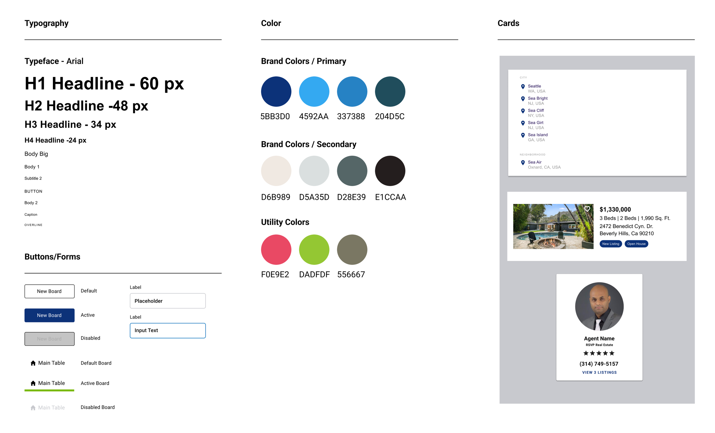
We had more freedom when it came to the image style, forms, and overall layout. We aimed to highlight ERA’s brand’s personality while keeping in mind how buying a new home can be an emotional experience. The Slide, titled Design System, shows the design elements such as typography, buttons with their states, usage of color to inform users and other UI elements such as cards.
High Fidelity Screens
In our final prototype, we made sure to implement in our high-fi prototype the feedback we got from both the users and stakeholders:
We made the questionnaire shorter and added the opportunity to skip the steps to enable the users to complete their profiles later.
We also included the property search menu on the top navigation bar for users that would prefer searching by using filters.
We added breadcrumbs, simplified and clarified CTAs, and made navigation between pages easier.
We simplified the dashboard by taking away the collaboration with agents feature following our discovery that agents’ hectic schedules would make it hard to implement it.
Desktop Prototype
After finalizing the screens with high resolution imagery and components, I created a functional prototype that displayed the functionality, imagery, and workflow for the end user. This prototype gave all stakeholders a look at the functionality of the site. Additionally, this helped confirm the final design choices that were then given to the development team.
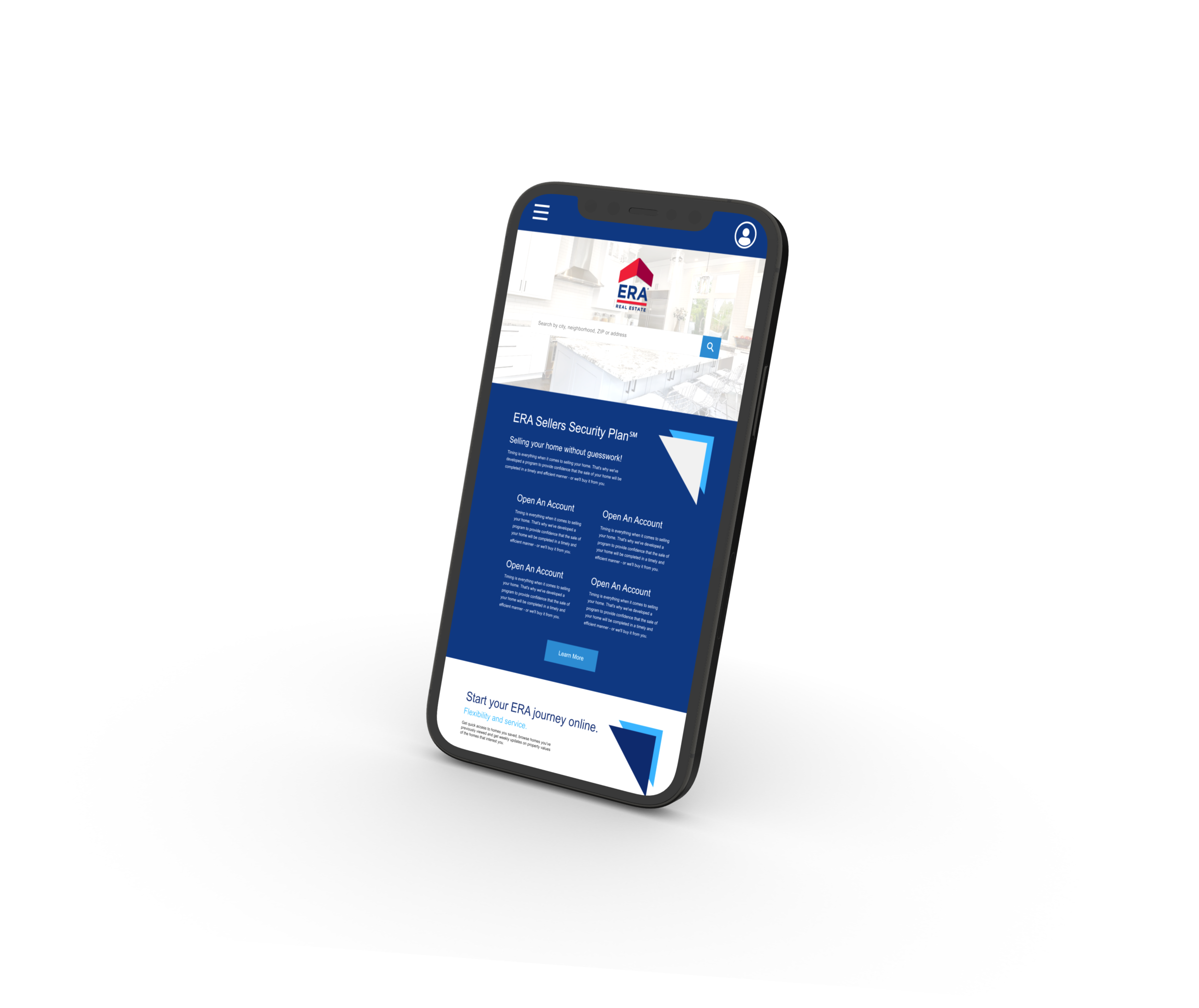
Mobile Prototype
After finalizing the screens with high resolution imagery and components, I created a functional prototype that displayed the functionality, imagery, and workflow for the end user. This prototype gave all stakeholders a look at the functionality of the site. Additionally, this helped confirm the final design choices that were then given to the development team.


